The ACR’s Web site has a new face—and it’s brighter, simpler, and more straightforward. The ACR relaunched its Web site—www.rheumatology.org—in early February and it is everything that the planners had hoped to achieve. “Everything we do at the College is designed to provide support for our members whether they be in private practice or in academic rheumatology,” says Stan Cohen, MD, president of the ACR. “The new Web site design makes it much easier for our members to access the information they need,” he adds.
The goal of the relaunch was to provide members with the information they need in a more accessible, user-friendly format, says Eric Matteson, MD, chair of the ACR Communications and Marketing Committee. Dr. Matteson’s committee spearheaded efforts to redesign the Web site that began in early 2008.
While the information on the newly launched Web site isn’t necessarily new, it is presented differently and in a way that gives the user greater access to similar content they may find of interest, he explains. For example, the old home page listed three subsites: the ARHP, the Research and Education Foundation (REF), and the ACR/ARHP Annual Scientific Meeting. This type of organization required the user to first understand “who” was offering the information before it could be accessed—not the most user-friendly way of presenting information. If you were interested in awards information, for example, on the previous site you would first have to determine if it was an ACR, ARHP, or REF award before you could attempt to locate it. On the new Web site, key content areas like awards information have been integrated into a single location to better serve site visitors; membership information, educational offerings, volunteer listings and opportunities, and advocacy efforts are just a few of the other content areas that have also been integrated. The membership directory has also been integrated. Members (as well as other users of the site) now need access only one membership directory rather than two different ones of find a member of the ACR or ARHP.
In addition to improving the presentation and integration of content, the ACR also updated its search feature, eliminated outdated content, and added a rotating feature to the home page and several other areas of the site that showcases current offerings, benefits, or organizational efforts. There is also a news section on the home page that alerts members and other site visitors to timely information says Dr. Matteson.
The best way to understand the changes is to take a virtual tour of the new Web site and compare it with the old one.
Home Pages: Old Versus New
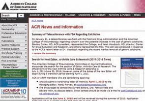
First, look at the old home page (below).
Not only were there navigation menus on the left side and along the top of the page, but there was a lot of information presented in the middle—too much according to site users. By conducting usability studies, the ACR discovered how members prefer to navigate the site and where they expect to find the information they’re seeking. As a result, the new maroon navigation bar on the top of the site presents the major areas of content based on user feedback: Membership, Practice Management, Advocacy, Publications, Education and Careers, and Foundation.

In addition to the new navigation, the new home page showcases ACR, ARHP, and REF offerings in a number of different ways. Most users will be drawn to the carousel featuring five rotating graphics on the home page (three rotating graphics on each landing page). These rotating graphics feature the most timely information and will change frequently. To see how this feature works, go to the green bar just below the main image on the home page and watch it rotate (or, click the light green box and watch it turn blue as the image information above changes). Click the Learn More button on any of these graphics to get more information (see below).
Still more content is featured midway down the home page via the News, Resources, and Take Action sections. The News box is the ACR’s primary way to let members know about timely information, and clicking the links within will take visitors to more information on the topic. The Resources box links to 13 popular information categories, including patient information, Medicare references, and awards and grants offerings.
The Take Action box is full of quick links to content members may be trying to get to quickly: become an advocate, support rheumatology research, join a list serve conversation, schedule a Coder Course, and many more.
Future Improvements
Dr. Matteson says that, so far, feedback on the relaunch is positive. “Our goal was to make sure that members could reach into the Web site and quickly find the information they need without distraction,” he says. Future plans include an enhanced search engine, new content in virtually every programmatic area, and improved features. “Web strategy is like a frame of mind; it is continually changing and open to new ideas,” he adds.
Terry Hartnett is a medical journalist based in Pittsburgh.


